A successful start-up

3|SHARE is an Adobe, business-level solution partner that specializes in Adobe Experience Manager on-boarding for Fortune 500 Companies.
Project overview
In 2012, a start-up from San Diego approached me in NYC to begin a branding and advertising campaign that would later help secure their spot as Adobe's premier business-level solutions partner and dominate the marketplace with an unprecedented 70%+ market share after its first year of growth. Four years later as acting Creative Director the company was purchased by Publicis and assigned to parent company Digitas, LBI.

My remote role allowed me to work in NYC for advertising agencies on various Fortune 100 clients when I wasn't building product, service, event branding and user experiences for this west coast start-up.
Design thinking process
• Empathize
• Define
• Ideate
• Prototype
• Test
2014 Responsive design
3 | Share
ROLES:
Product/UX Designer
Visual Design Lead

Sept 2013 - Jan 2017
Problem statement
CTO's of Fortune 500 companies have the problem they could not research and locate enough online support for Adobe Experience Manager at its release. Our solution was to provide a rebranded, mobile-first, responsive website with enough information to engage organic searches, so CTO's can feel less frustrated and unsure about the lack of support and online documentation from Adobe.
Updating the static design

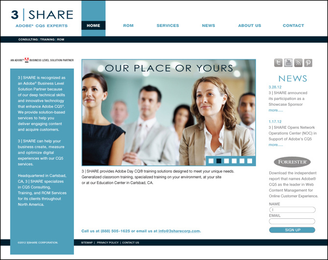
Although the old site design was acceptable for 2013, it wasn't going to be enough to convince CTO's to embrace experts without a mobile strategy, especially if they cant research this site on their mobile device, let alone find in organic Google searches.

Previous Home Page design
Users and audience
Preliminary data from the marketing department revealed a core audience of CTO's and heads of IT. These were the decision makers able to approve AEM migration and support.
My Roles and responsibilities
The team of 5 consisted of a copywriter, marketing director, a project manager, a senior developer, and myself whose roles and responsibilities were as follows:
• UX / Product Design Lead
• Visual Design Lead
• UI Design & Rapid Prototyping
• Design System development
Scope and constraints
The project scope was 6 months and constraints included:
• Mobile-first MVP
• Bug fixes before launch
• Scope creep
The Process
Market / User research findings

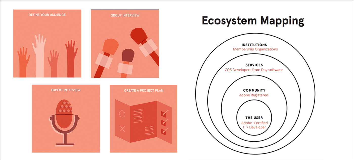
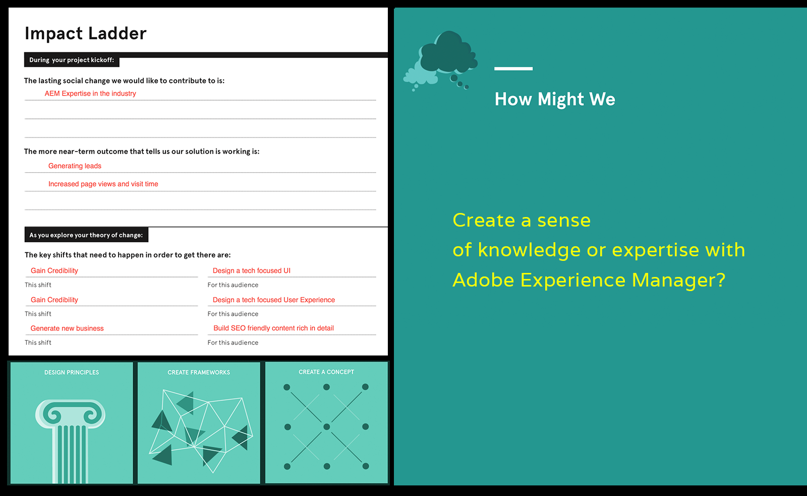
I interviewed the main stakeholders (CMO & CTO) about their target market and current user base analytics. Using a variety of research methods such as an ecosystem map and a research questionnaire I was able to collect valuable data on:

  • Competitors
  • Target pain-points
  • Target users
  • Demographic data
  • Preferences
Personas

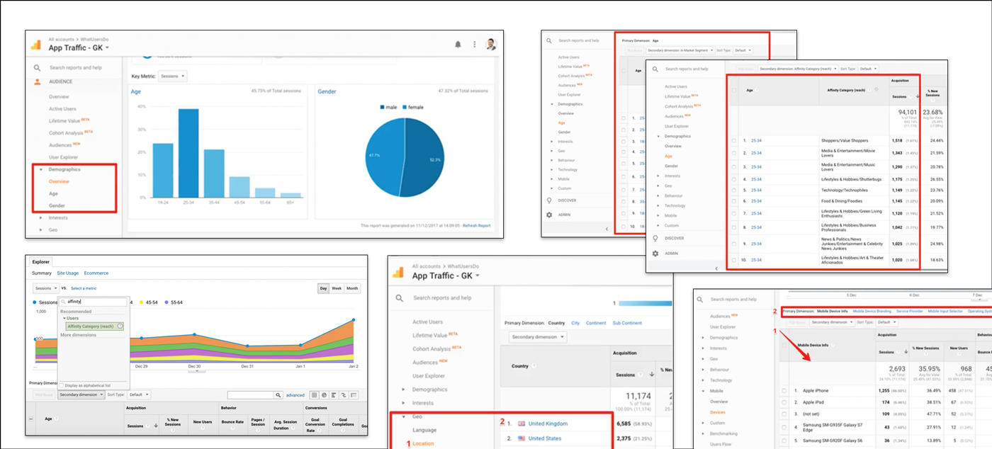
Access to the GA dashboard of the current site allowed me to gather any useful demographic data to zero in on building the personas we want to target. Specific areas included:

  • Age and Gender (basic demographics)
  • Affinity secondary dimension to the Age demographic to reveal the main interests of our audience (shoppers’, ‘technophiles’, ‘foodies’, ‘music lovers’)
  • In-Market Segments revealed connections with customers who are actively researching and comparing products or services across the Google Display Network (YouTube, paid search results via AdWords, display ads via AdSense, etc).
  • Geo location tracking to reveal where in the would our audience is visiting us from.
  • Audience devices revealed exactly which brand of mobile they’re using and even what service provider or operating system they prefer.

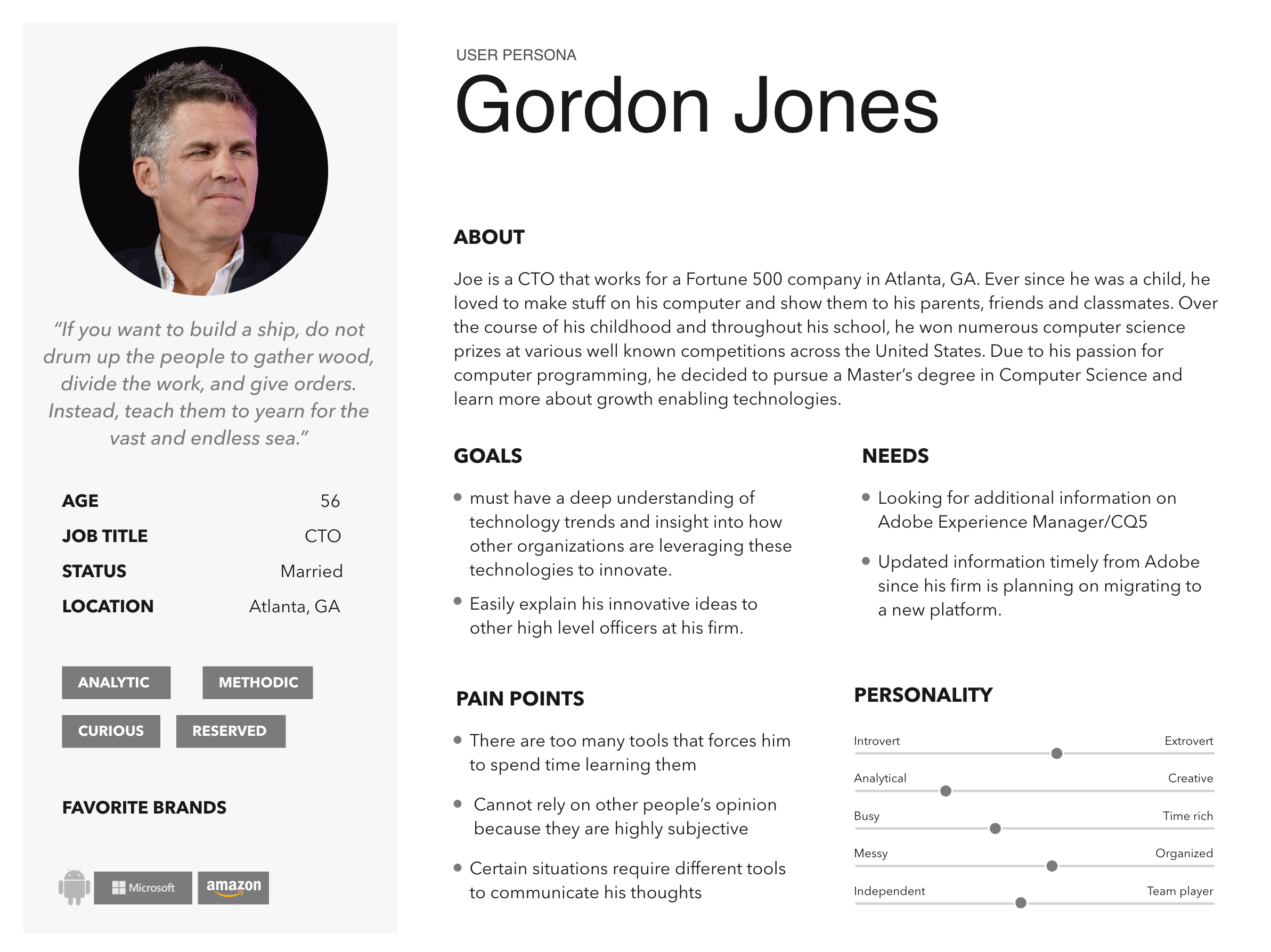
Secondary research online revealed other examples of specific buyer personas (IT decision makers) insights and motivations such as proof of his department’s investments provide value; a lightning-fast website, flexible and scalable products that grow with the company, no downtime or virus attacks, so the company stays productive—he’s done his job well. Content for this department head should be focused on how to implement new solutions.

Ideation: design solutions

Using a mix of human-centered design methods:

  • Impact ladder worksheets helped to prioritize outcomes and align a successful and shared vision.
  • Design principles to align themes and cluster them in a post-it note exercise in order to find common variables.
  • Create a framework from bundled ideas to measure against design principled groupings and looked for variation in logic
  • Concept creation based on answers from How Might We questions.
Sitemap
Site architecture was a began as a messy process of card sorting and revision of the current site grouping new components under necessary pillars to provide for scalable growth. The result was a clean, organized structure.
User flows

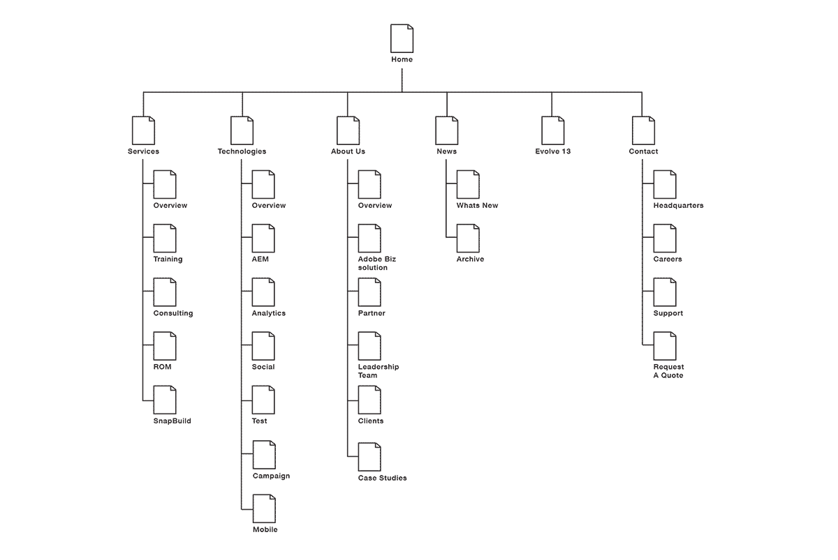
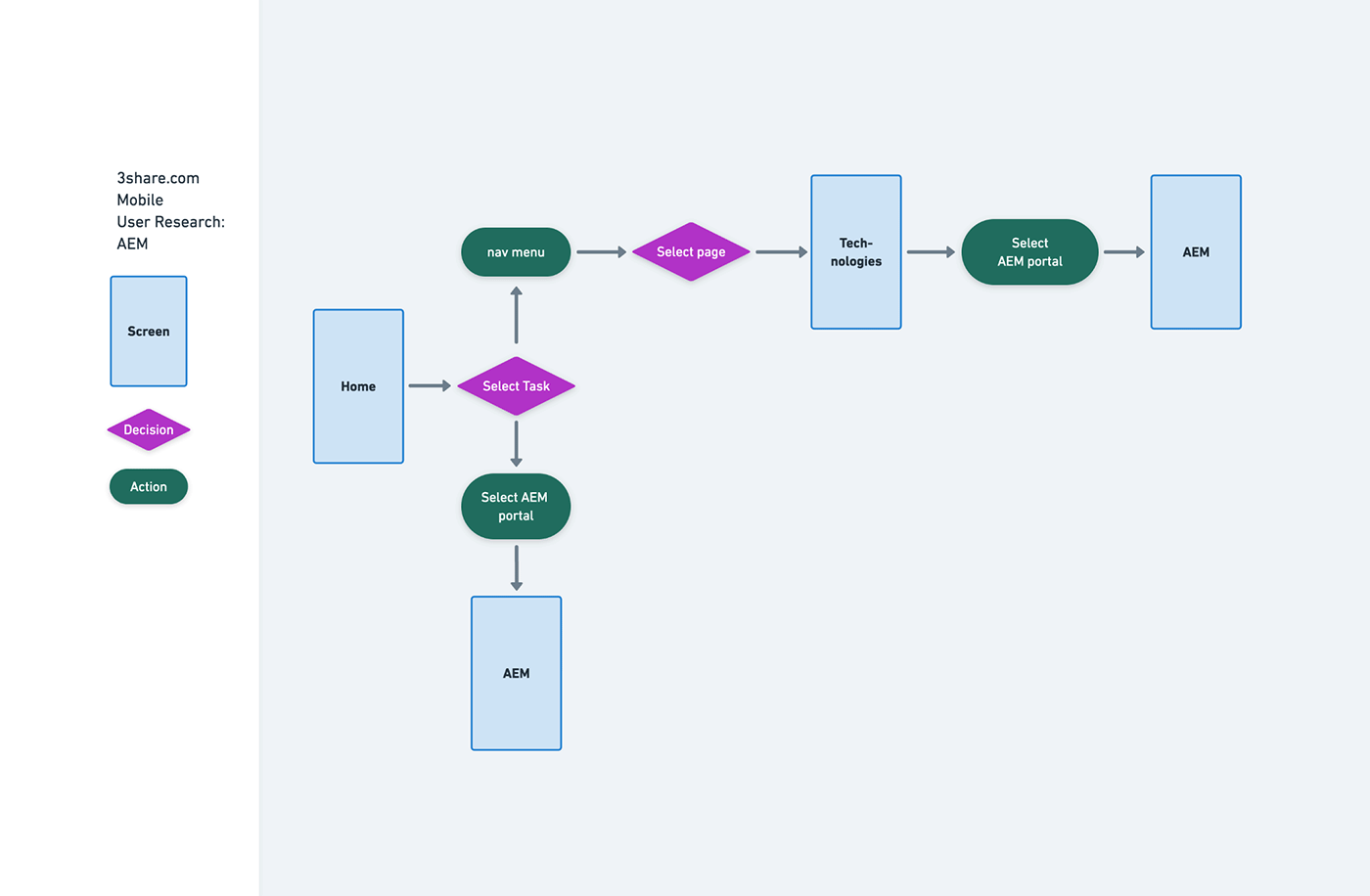
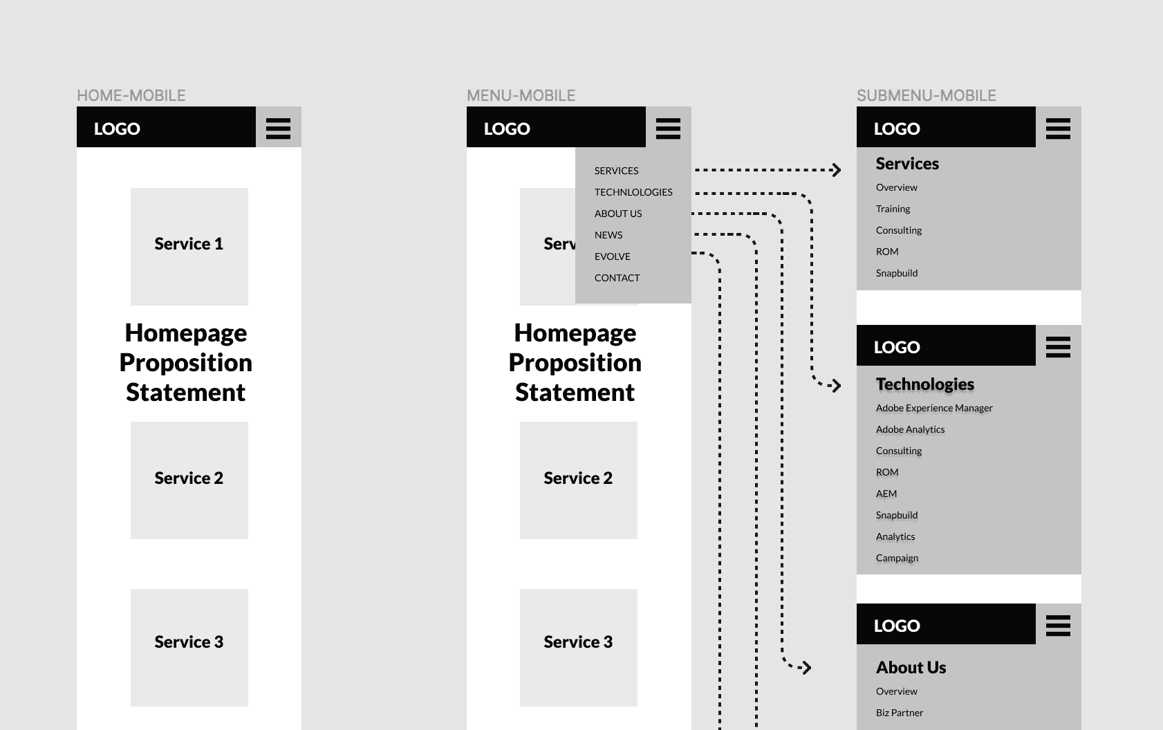
User flows allowed me to illustrate to the team how to simplify the user journey to help them reach their most important goals within the website and forced conversation about refining site architecture and service offering hierarchy.

Sketches & Wireframes

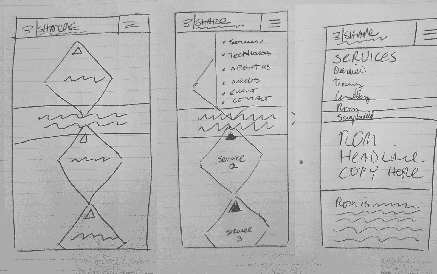
Low fidelity sketches were mostly internal organization and planning tools which would later become low fidelity wireframes to share with the team.

  • Sketches were quick for internal ideation
  • Once the design solution became evident, I moved onto wireframe proofs
  • The main purpose of the sketches was to roadmap the design process before wasting time on a computer screen.
Prototyping

I ran prototypes through a variety of methods:

  • Paper and pencil sketches
  • Screen recordings
  • Short video walkthroughs built in After Effects for the most important screens to get stakeholder approval before development.
Usability testing (findings)

Prototype testing was performed on pre-screened candidates arranged by the marketing team, consisting of user groups who interact with the previous site segmented by device and use case. The tests were carried out on a staging site prior to launch to look for bugs and discovered:

  • Positive feedback on mobile with load times reduced by eliminating desktop feature art elements such as unnecessary photography.
  • The mobile site read like a white paper but on a black screen for a no-nonsense, quick loading approach.
  • Enlarging the spacial distance between links and buttons on mobile
  • Crisp and colorful graphics/imagery
UI design

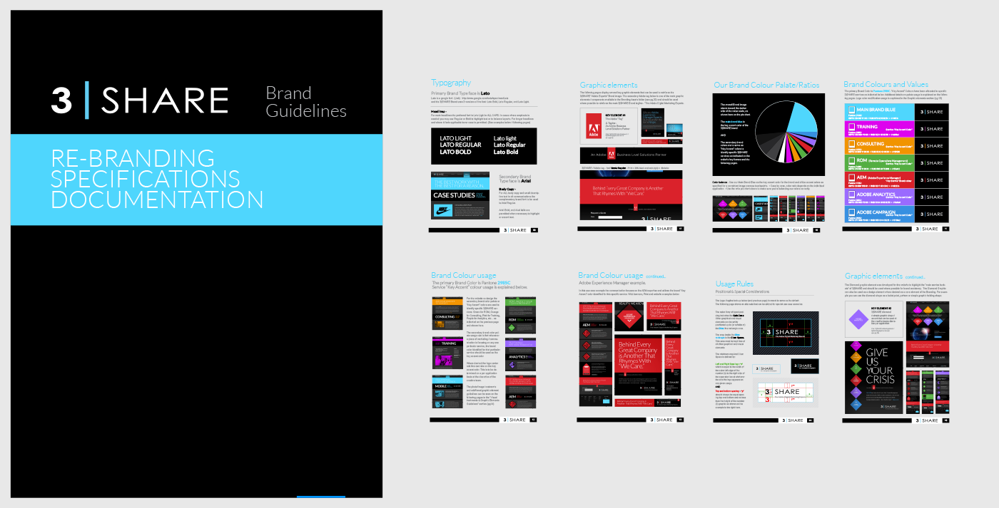
The pattern library was developed through an Atomic design structure distilled from the revised brand guidelines.

  • I built components first and deconstructed them for reusable elements on other pages.
  • Organic design was driven by predetermined elements and content.
  • Inspired by Adobe's early design system to mirror continuity between the two brands as technology partners.
  • We chose a dark theme to contrast from the first corporate iteration to something sleek and tech inspired, before it became a design trend a few years later.
Outcomes & Results
2014 Responsive design
In short, a success that was short lived
Challenges
This was my first responsive design at the time, but I had built a working relationship with the marketing director and gained his trust developing content so I just had to deliver assets in a whole new way for the development team. Through the guidance of my project manager I was able to deliver what was needed easily by asking for reference material.

Many of my concerns were addressed through user testing and validating designs with my development team.

  • My biggest fear was getting this project off the ground but after the initial concepts were delivered, managing expectations was easier.
  • My biggest struggle was wrapping my head around the mobile first concept. At the time (2013) it was a relatively new arena but I was quickly brought up to speed by documentation through Adobe and my development team.
  • Final designs were delivered as PSD files with components grouped and labelled for reproducing symbols in the new site framework.
  • My biggest mistake was not working in sketch at the time to prototype. I was using Illustrator and Photoshop so having to extract certain assets was not as easy as a direct export.
  • I worked backwards from delivery with my project manager and dev team to deliver the easiest possible programming solution at the time.
  • I wanted to follow up with Google's HEART framework to track metrics on happiness, engagement, adoption, retention and task efficiency, but marketing was experiencing an increased response and high traffic volume on the new site to my delight so metrics were abandoned for other projects.
previous example
next example

Need more proof?

Let's discuss your next project.

email me