Non-profit now

A business/blog, 100+ screen, CMS-enabled, IE 11+ friendly,
responsive website built in record time for a Non-profit without a clue.
Project overview
I received news about this project with a two month lead to launch and accepted it as an opportunity to use my art director/project management background to tame this wild beast. On the plus-side, the marketing team had readily available
• Content (artwork and copy)
• Existing site reference point
• Print Brand Guidelines
• Market research data of current site

Since movement of the launch date was impossible, I sold the marketing team on a "growth-driven" design approach; the entire responsive, skeletal structure and most important features were fleshed out with approved content readily available. I could then integrate the CMS to allow any real-time content updates from the marketing team, while I focused on the responsive mobile and tablet optimization after the soft launch deadline.
Design thinking process
I focused on the five-stage design thinking model proposed by the Hasso-Plattner Institute of Design at Stanford (d.school).
• Empathize
• Define
• Ideate
• Prototype
• Test
2019 Responsive Redesign
Community foundation
of Broward
ROLES:
Product / UX Designer
Visual & Development Lead

May 2019 - Jan 2020
Problem statement
Many users of the old website had the problem they could not access resources available on mobile, while the tablet and the desktop experience was less than friendly to navigate and discover new content. New users found little reason to stay or engage. The challenge was to quickly deliver a robust, responsive, B2C website, for a non-profit with a diverse audience, while incorporating a wish list of requested features including:
• A reorganized resource library for existing users
• Address usability issues and pain points
• Site architecture
• Updated branding
• Full CMS support
• Responsive across mobile, tablet and desktop
• Blog feature
• SEO integration with Google Analytics
• Ten years of news archive data
sorry e.t., not mobile friendly either

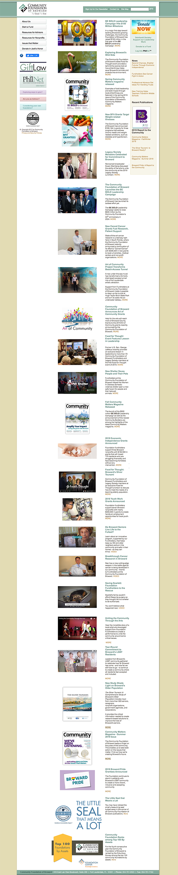
I ran a heuristic evaluation along with an empathy map to uncover additional pain points with the site unidentified by the marketing team. That old site was uglier than E.T. with a wig on.

Previous Home Page design
Users and audience
3 User groups identified from existing site data and surveys provided by the marketing team to account for the majority of users.
My roles and responsibilities
The team of 4 consisted of a copywriter, marketing director, project manager, and myself whose roles and responsibilities were as follows:
• UX / Product Design Lead
• Visual Design Lead
• Development Lead
• UI Design & Rapid Prototyping
• Design System development
• Deployment

Scope and constraints
Project scope was 4-6 months and constraints such as time limited to an MVP launch date in 45 days. Other constraints included:
• 300+ Screens total (900 responsive)
• CMS integration
• SEO optimization
• Google Analytics integration
• Mobile /Tablet MVP
• Current Internet Explorer users (large base above 20%)
• Migration of preexisting data library and Advisor resources
• Testing / Bug fixes
• Scope Creep
The Process
Market / User research findings

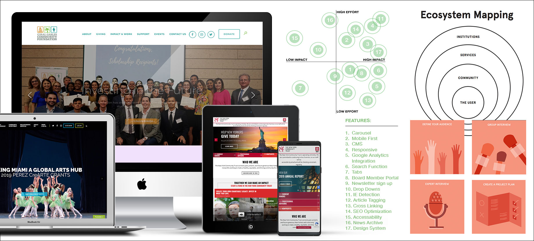
I interviewed the main stakeholders (Marketing team) about their target market and current user base analytics. Using a variety of research methods such as ecosystem mapping, an impact effort grid and developing a project plan the team I was able to share data about:

  • Competitors
  • Target pain-points
  • Target users
  • Uncover demographic data
  • MVP features & functions
Personas
  • When defending UX decisions and delivering proofs I would refer to these personas taken from samples of real users provided by the marketing team at the beginning of the project.
  • Using a mixed-method approach to developing the personas by involving stakeholders, collecting real customer data from the marketing team and user research testing on site.
  • The personas focused on information about context, problems, and motivations.This information was presented to the product team prior to the first round of drafts as pdf's to the product team.
  • Impact made on design included characteristics such as default larger type and no grey type, the consistent use of buttons and drop downs whenever necessary and rollover states that were very pronounced and smooth.
  • Reflecting back on the personas during the mobile phase of development to build a screen that was expected and consistent with the desktop version however, tailored to a youthful experience.
User journeys

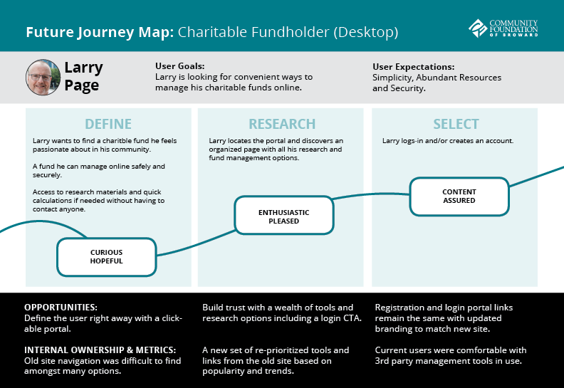
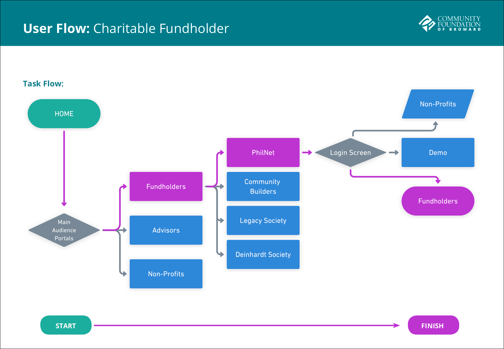
I mapped out the users’ steps to see how I could simplify their journey to help them reach their most important goals with the product.

  • I used journey mapping to simplify the design process by removing unnecessary steps and screens to design for.
  • User goals were based on the site's content and importance to the marketing department.
  • Users felt comfortable and each step of the user journey was intuitive to the target test groupsWhile designing screens I ran into content link redundancy which I was able to combine as tabs on certain screens, thus reducing steps in the user flow.
  • User journey mapping helped reduce screen redundancy by examining client content closer, examining areas that could be consolidated to reduce steps in the user journey.

Benefits:

  • The map forced conversation and an aligned mental model for the whole team. This shared vision is a critical goal of journey mapping, because, without it, agreement on how to improve customer experience would never take place.
  • Second, this map was able to define the foundation's opportunities to engage with current and future fundholders, thus potentially increasing donations for the non-profit.
Ideation: design solutions

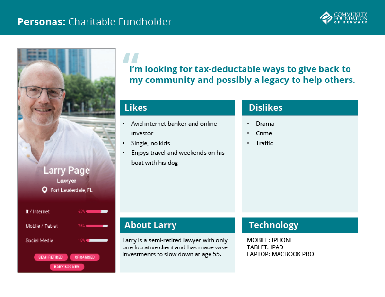
Using a mix of human-centered design methods:

  • Design principles to align themes and cluster them in a post-it note exercise in order to find common variables.
  • Prototype report card worksheet on certain high profile pages to track and validate assumptions and iterations.
  • Prototype mapping identified important improvements to be added by incorporating the user journey map and identified any shifts that needed to take place.
  • Brainstorming session with the marketing department uncovered some valuable key points to be addressed before prototyping.
  • Paper and pencil crude prototypes / drawings and low-fidelity wireframes helped to solidify ideas before presenting to stakeholders as polished proofs.
Sitemap & user flows
UX flows and sitemaps helped to plan for and create an easy-to-use product right from the very beginning, further eliminating redundancy and the need for extra screens; having a clearly defined UX flow allowed me to troubleshoot and pinpoint where things could have gone wrong. I was able to eliminate 25% of proposed screens from the marketing department's proposed sitemap logic and defend it with a clear user journey.
Wire framing

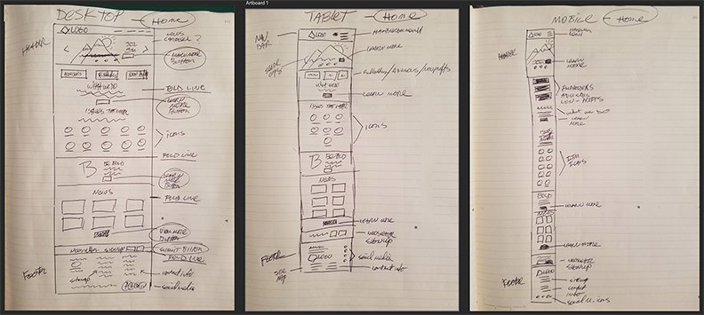
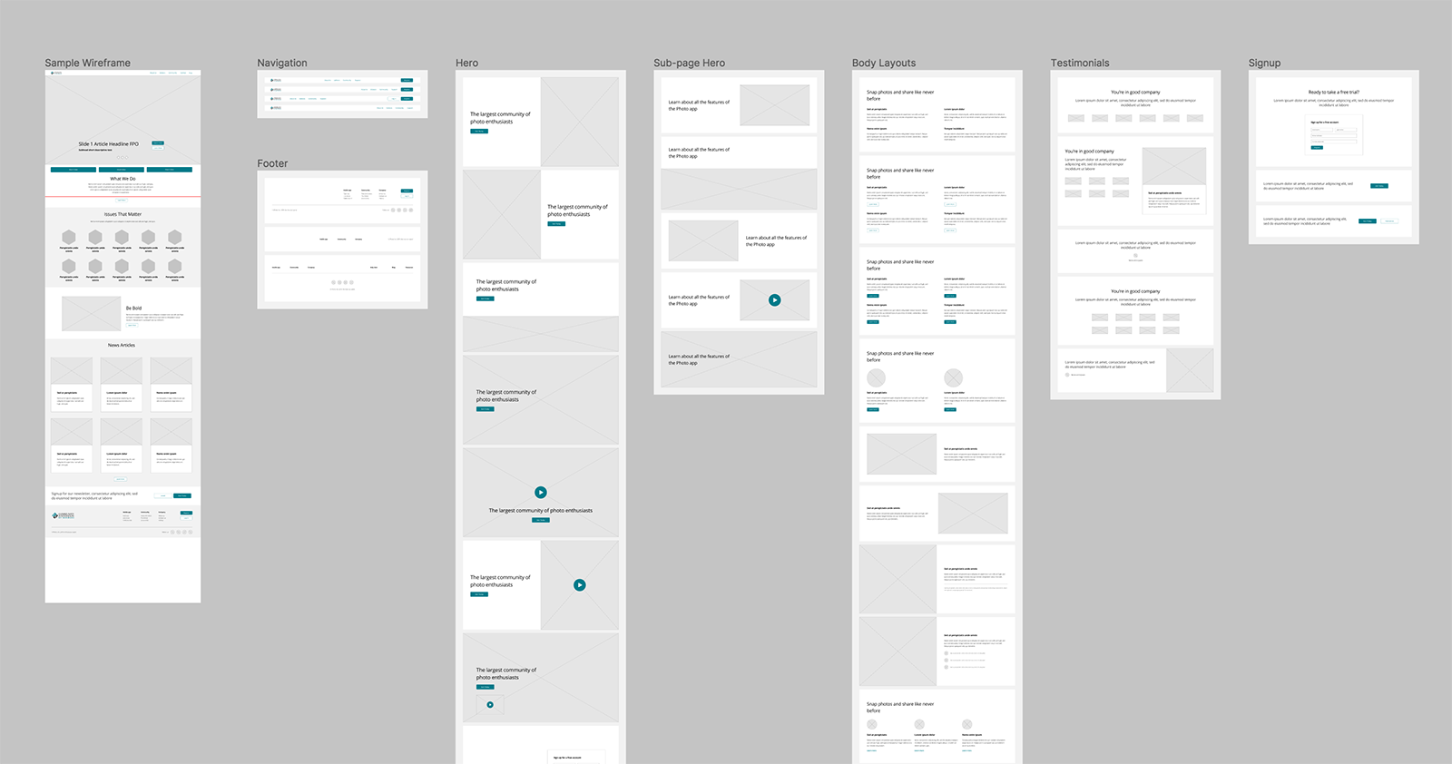
Low fidelity wireframes were mostly internal organization and planning tools which would later become high fidelity wireframes for the home page and other MVP pages for the soft launch approval.

  • Low fidelity (paper & pencil) wireframes were easier to produce
  • Testing was not needed
  • Only one iteration was used
  • The main purpose of the sketches was to roadmap the design production process and arrange content into a new responsive grid layout.
  • Knowledge about my users and their goals influenced my sketches by keeping the layouts clean, uncluttered and consistent.
  • Although this stage was internal it allowed for quick iterations based on content direction changes.
Prototyping

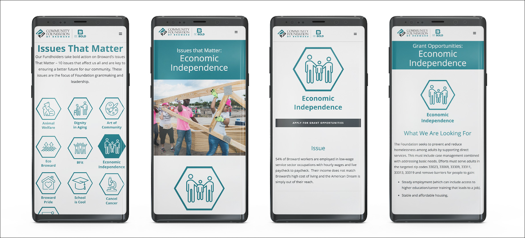
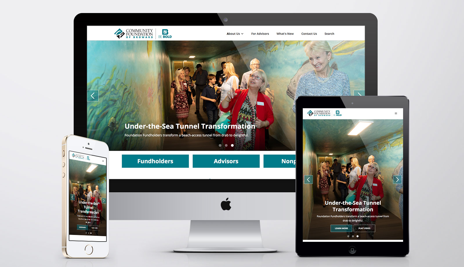
As per client request Hi fidelity wireframes were delivered in the form of working prototypes in the webflow browser. This was a first for me since this its mostly a developer tool, but I was able to quickly create master layouts that adhered to clean code production.

  • To roadmap the design production process
  • Initial testing proved positive reception and results.
  • 90% overall page approvals within one iteration site wide!
Live prototyping was done in webflow after static mockups were approved in sketch on the home page and UI pattern library to reduce time to launch. Only achievable through management of expectations of deliverables and up-front timing without scope creep.
Usability testing (findings)

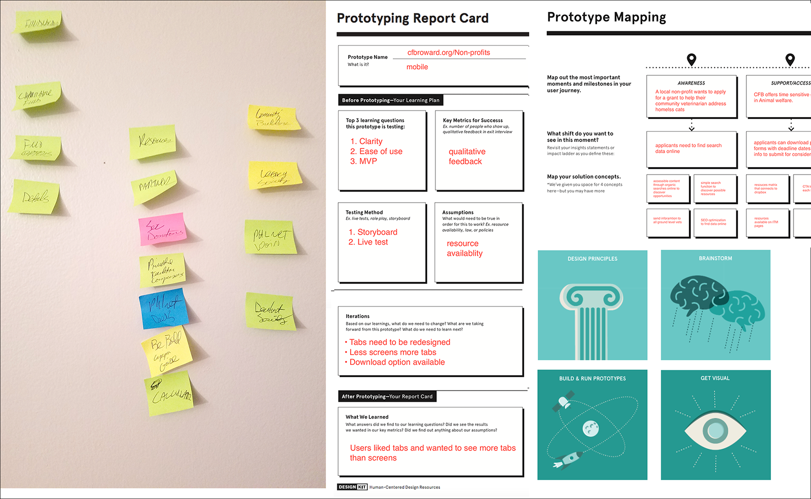
Prototype testing was performed on pre-screened candidates by the marketing department consisting of user groups who interact with the current site segmented by device, platform and use case. The tests were carried out on a staging site once pages were approved by participants at the foundation on a timely basis. Results were better than expected with users reporting:

  • Ease of use
  • Responsive UI feedback
  • Micro copy interactions for added guidance
  • Increased legibility and readability associated to larger and clearer typefaces
  • Crisp and colorful graphics/imagery
UI design (pattern library/style guide)

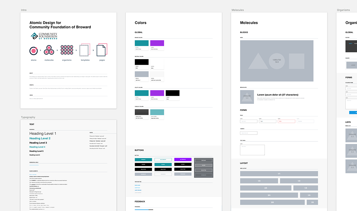
Once I received approval on a master page layout and the visual display system I was able to flesh out pages into expected results as live prototypes for CMS editing.

  • A corporate visual style was distilled from their print brand guidelines.
  • I was inspired by IOS and material design guidelines, modifying a balance appealing to their target base on Desktop and tablet while modifying mobile for younger users.
  • Web, tablet and mobile platforms
  • I'm most proud of the speed to launch by prototyping in a developer tool and using a growth driven design model to supply CMS features on the back end after launch.
  • Since most of the audience was in the 55+ category, I made more use of the real estate by making type and features larger with plenty of interactive feedback in the final designs.
  • Designing for seniors was challenging because everything had to be visually tweaked for the audience. Turns out it was no different than beginning with a platform that was ADA compliant as my starting point.
Outcomes & Results
vist the live site
Laundry list of miracles achieved
Challenges
Time and scope creep were perhaps the greatest challenges. It was a physical milestone the department had set without factoring in the production process and what was involved in UX. I felt myself limited with time for design and research, but since I was the project manager I reframed the deadline to a MVP of reasonable scale and justified many design decisions based on heuristics and testing assumptions during live prototyping phases.

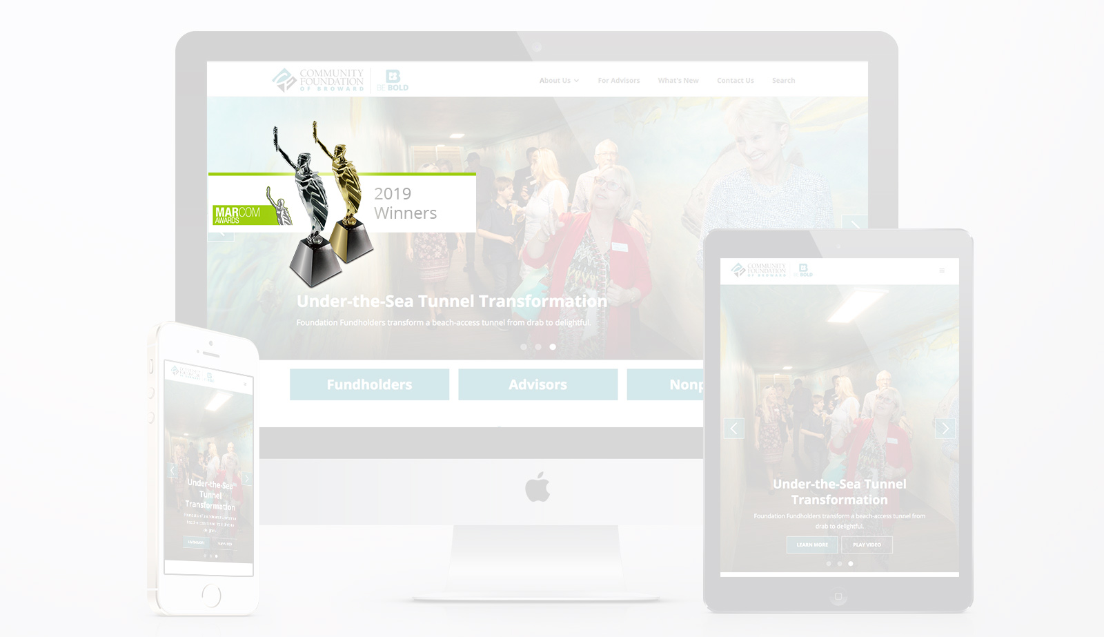
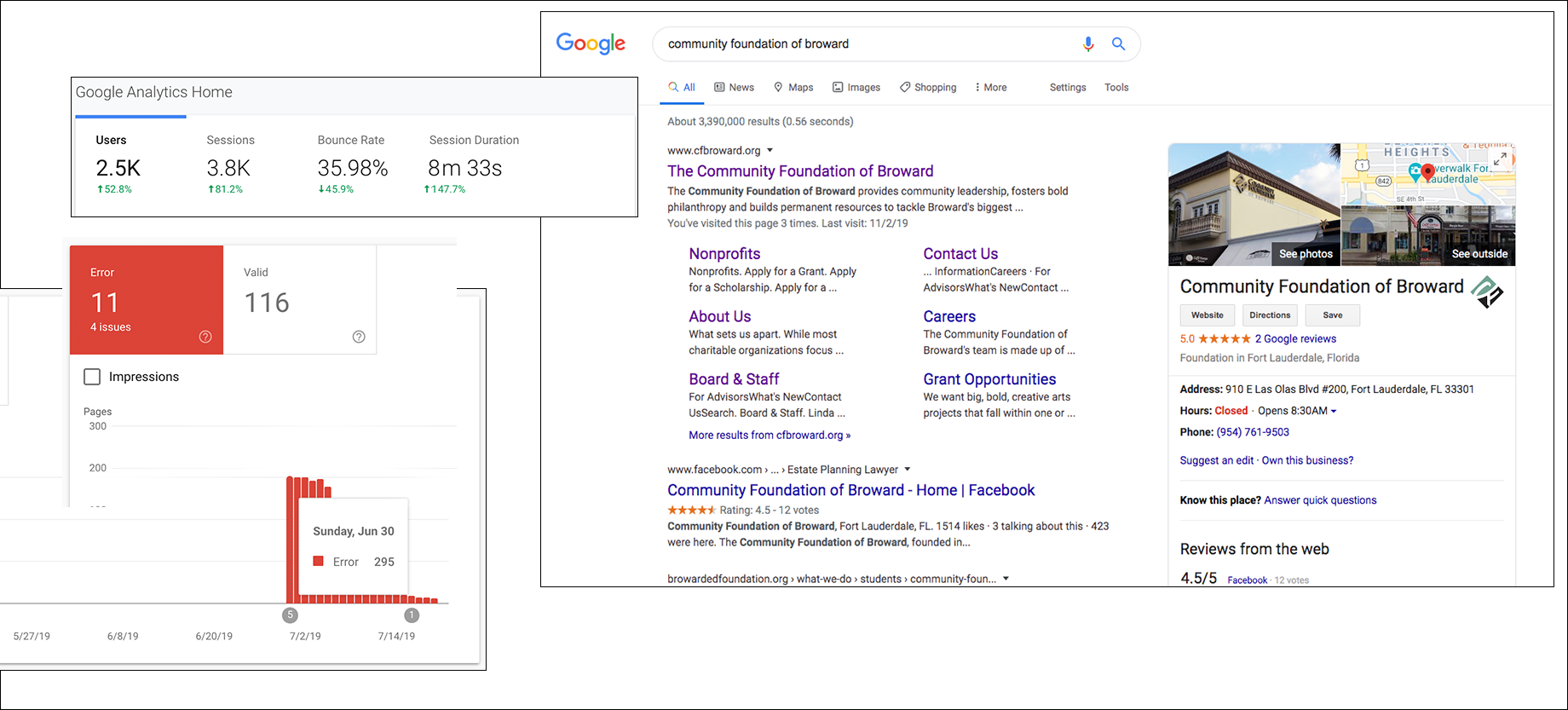
Much of my concerns were eased when optimizing the SEO and allowing metrics to justify design decisions. With reduced errors and bounce rates coupled with increased page visits and durations, it was easier to accept a 2019Marcom Platinum and Gold Awardin the non-profit category.

  • My biggest fear was negative throwback and resistance from users of the old site during testing, but was relived to discover a 90% success rate on first iterations.
  • My biggest struggle was convincing the client designing for Internet Explorer was useless so we opted for an MVP with s pop-up that detected IE users and opted to download other browsers directly from their source to revisit; a custom feature requested by the client asking to make the site Internet Explorer friendly since almost 1/3 of their current users were 60+ on dated tech.
  • Having a basic design system with components and a home page design approved early on helped manage client expectations and built rapid trust and approval.
previous example
next example

Need more proof?

Let's discuss your next project.

email me