Rebranding PR

A responsive, B2B website complete with rebranding
to become a lead generating tool.
Project overview
Worldcom Founder and CEO of an established south Florida PR Firm, Gary Bitner approached me to bring his dated website and brand mark into the 21st Century. Upon my return to South Florida, I met with my former employer and told him of my new found digital skills and we agreed to take on his currently outdated site.

Design thinking process
Stanford (d.school) 5 stage design thinking model:
• Empathize
• Define
• Ideate
• Prototype
• Test
2021 Responsive Redesign Prototype
Bitner group
ROLES:
UX/UI Design Lead
Visual & Development Lead

May 2020 - Feb 2021
Problem statement
Individuals and organizations looking to hire a global PR firm in South Florida have the problem they can't find many options that embrace digital technology, as well as press and reputation management in their service offerings. The solution should deliver a lead generating tool embedded in a rebranded, responsive web portal that showcases the firms accomplishments within the industry.
Heuristic analysis

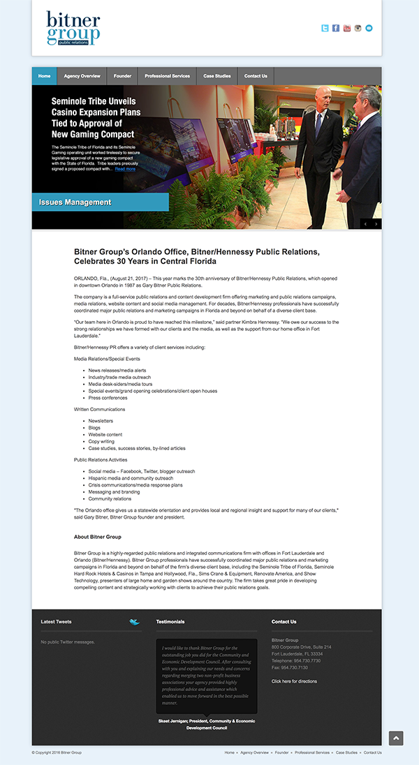
As the first step of the redesign process, I evaluated the existing website with a heuristic review method. I took the site through a user journey emulating a potential client looking for missed opportunities on conversion, quality of content and mobile friendliness.
Initial Pain points:

  • Outdated architecture, navigation and branding
  • Lack of mobile and SEO integrations.
Previous Home Page design
Users and audience
Identifying the core audience required an extensive interview process with the CEO and marketing Director. Audience ranged from celebrities to government agencies, non-profits, and corporations.
My roles and responsibilities
The team consisted of myself and a copywriter as a freelance opportunity. My roles and responsibilities were as follows:
• UX / Product Design Lead
• Visual Design Lead
• Development Lead
Scope and constraints
The Project scope was 4-6 months but the project remains in development from constraints such as:
• Stakeholder priority
• Final approval
• Budget
• Developer handoff
The Process
Market / User research findings

When designing the new features of the product, I researched qualitative data because it is more descriptive and open-ended, allowing deeper insight.

  • I researched a variety of direct competitors in the local, national and global markets.
  • Competitive research affected the overall strategy by creating opportunities for robust user experiences and content unavailable on the current site and product wish list.
  • Certain aspects such as the firm's size, location and business focus were considered while doing research to identify relevant comparative strengths.
  • Smaller firms who embraced digital transformations to their sites gained a larger presence in organic searches, thus proving more credible.
  • After developing a list of direct competitors I used a simple SWOT analysis to determine which features were the most important to focus on.
  • I created a list of questions to ask the identified user group and ran it through marketing and CEO to answer questions on client's behalf to uncover deeper insight into building personas.
Personas

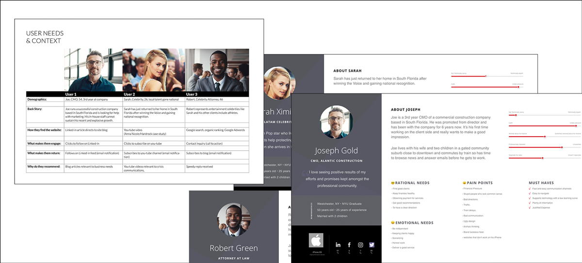
Based on data gathered from the stakeholder interviews. I set up three personas referring to them throughout the entire product development process to defend the users needs vs. client wants.

  • I involved the CEO and his marketing team to deliver background data on past clients as my main method of research; extracting quantitative and qualitative data to target the efforts of most profitable visitors (potential clients).
  • Each persona highlighted context, problems and motivations.
  • I presented this information as a draft review in the beginning with the CEO, to have a mutual understanding of his target group motivations.
  • The personas had a positive affect on the design. I was able to push for advanced features and design changes justified a more advanced look past the stakeholders desires.
  • I used these personas to amplify strategy during the screening of the first high fidelity wireframe delivery.
User journeys

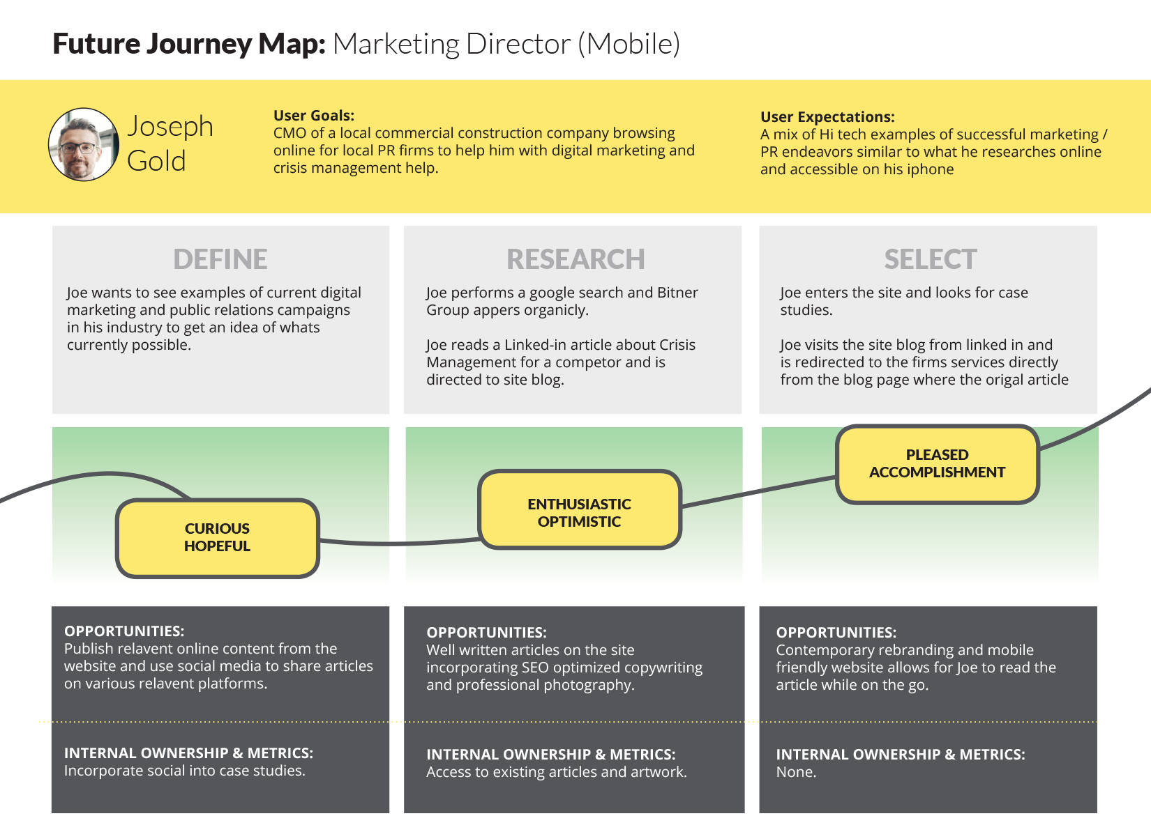
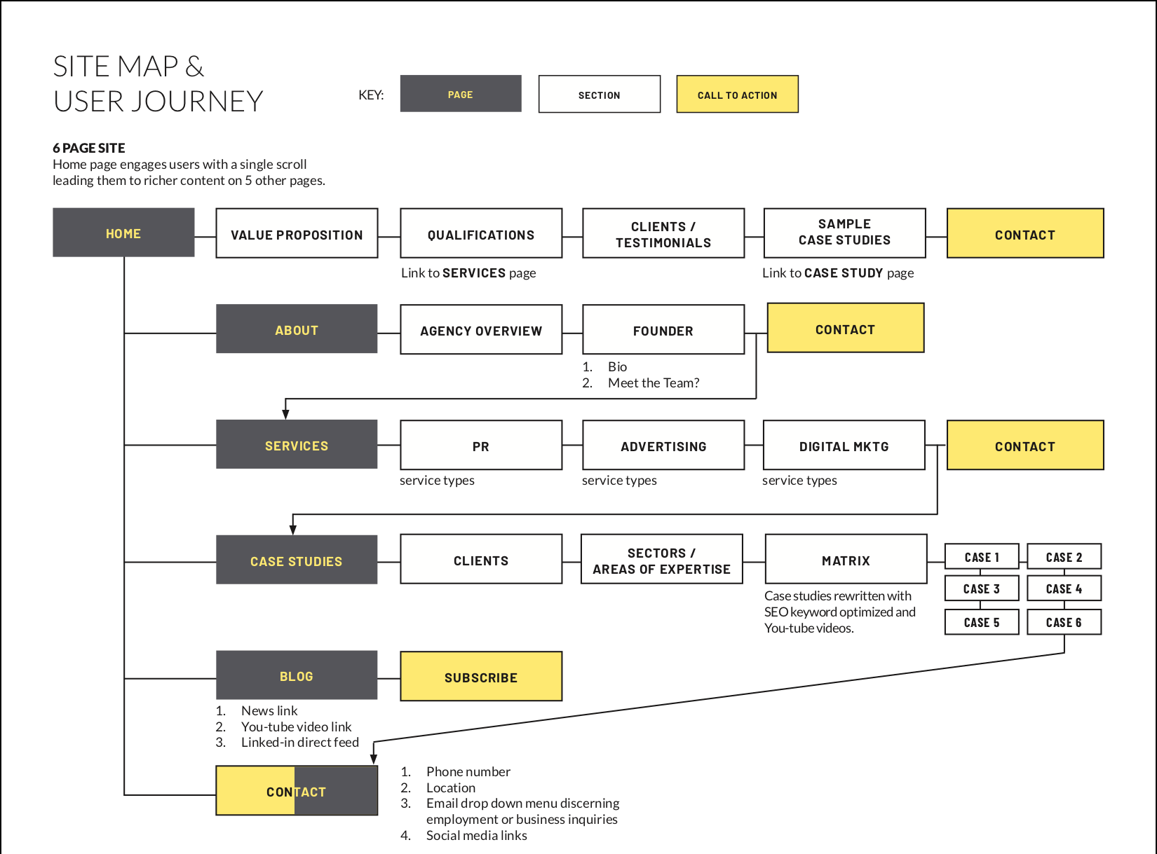
I mapped out the users’ steps to see how I could simplify their journey to help them reach their most important goals with the website.

  • User journey mapping allowed me to plan the site architecture and simplify user tasks based on their level of importance.
  • Importance of user goals were predetermined based on the majority of user profiles that shared common traits.
  • User journey steps were determined by card sorting and post-it notes.
  • User journey mapping helped me design a better product by simplifying the sites architecture and implementing new features and screens.
Ideation: design solutions

Using a mix of human-centered design methods:

  • Design principles to align themes and cluster them in a post-it note exercise in order to find common variables.
  • Prototype report card worksheet for certain pages to track and validate assumptions and iterations.
  • Brainstorming session with the marketing department uncovered some valuable key points to be addressed before prototyping.
  • Internal paper and pencil crude prototypes / drawings and low-fidelity wireframes helped to solidify ideas before presenting to stakeholders as polished proofs.
Sitemap & User flows

I devised two versions for the user journey of the same task and tested them with prototypes to find out which one works the best.

  • I determined the process based on level of demand for a particular feature; the higher the importance, the more likely a user flow test would follow.
  • The test user felt confident at each stage of the process they were accomplishing a goal quickly and efficiently.
  • I ran prototype tests with the main stakeholder and a few of the company employees.
Wire framing

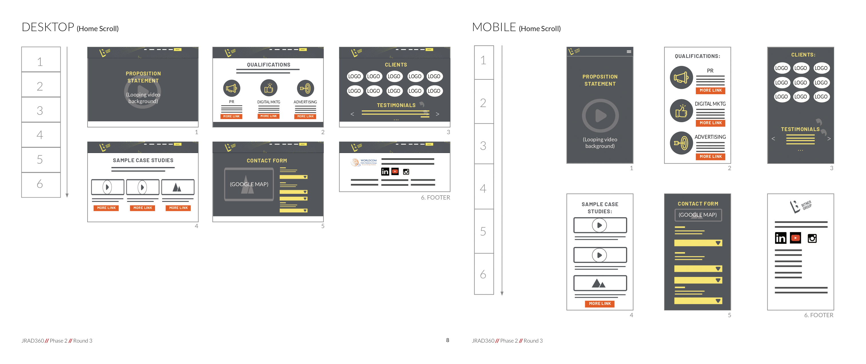
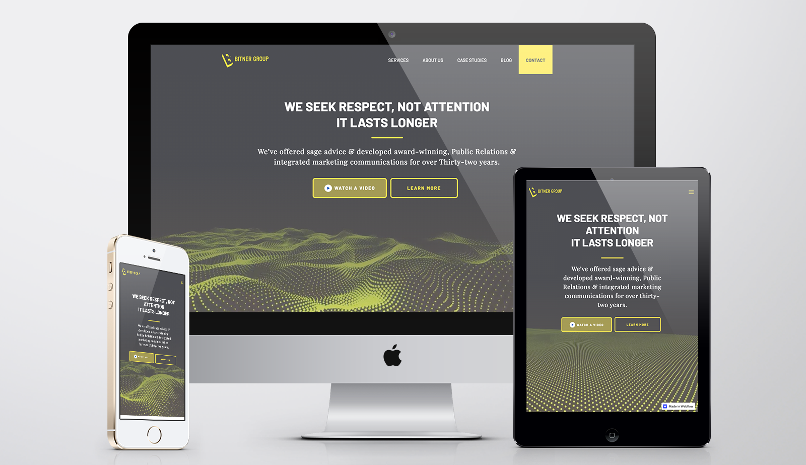
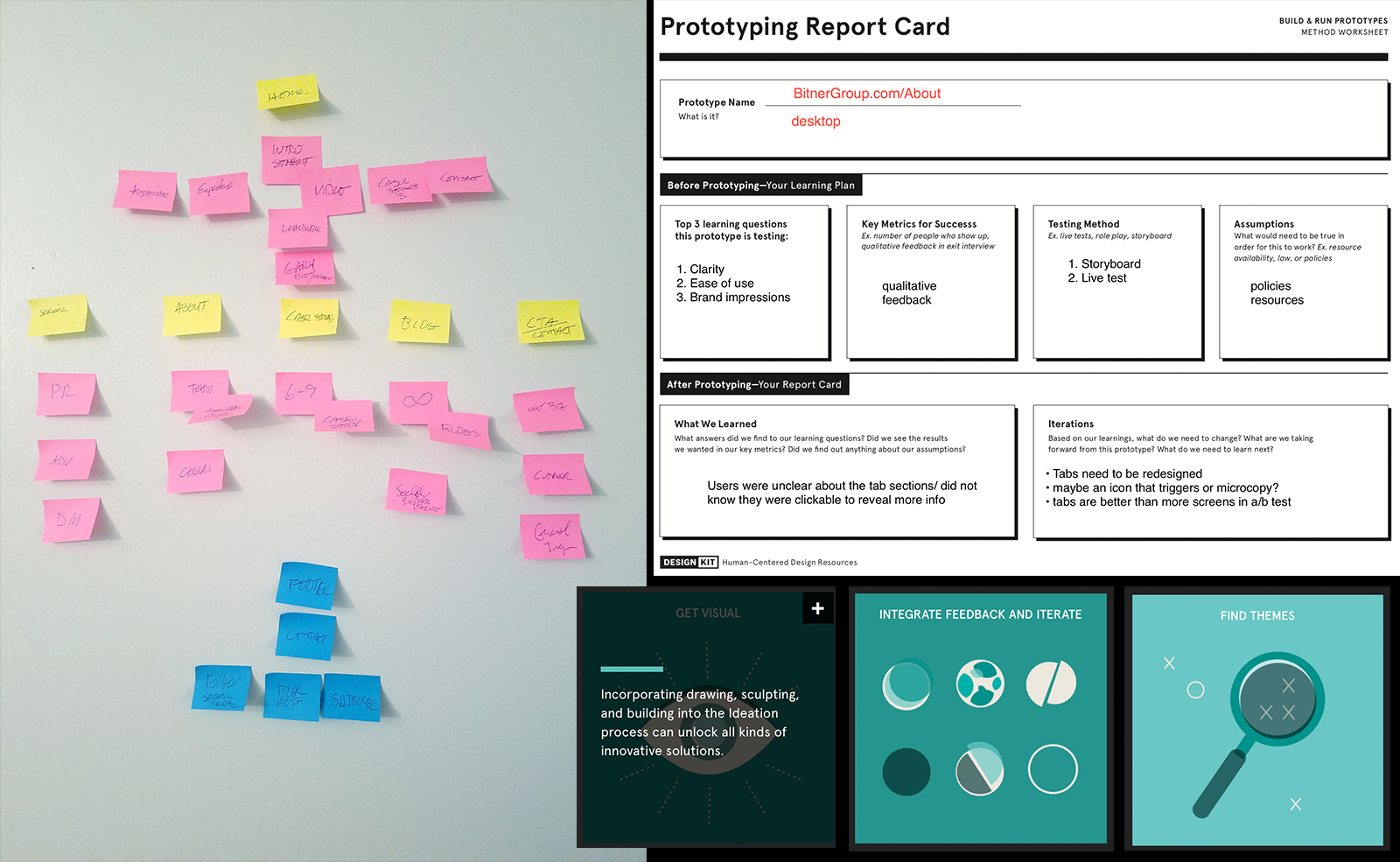
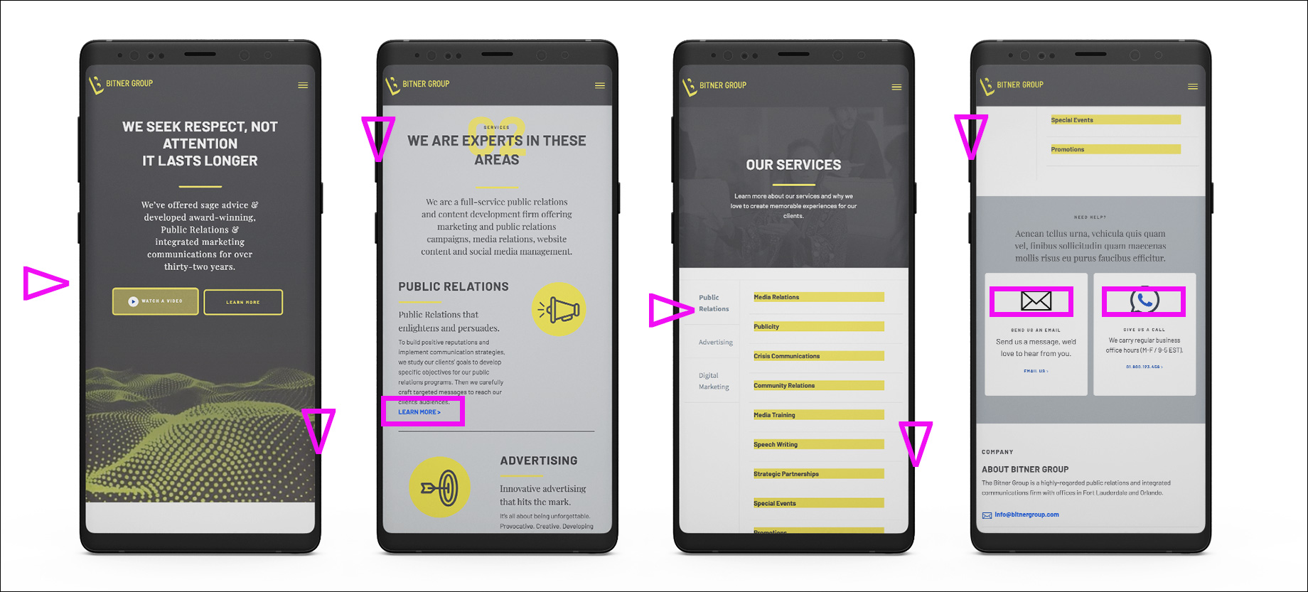
Low fidelity wireframes submitted for testing and initial proofing purposes.

  • Low fidelity (paper & pencil) wireframes were easier to produce
  • Testing was not needed
  • Only one iteration was used
  • The main purpose of the sketches was to roadmap the design production process and arrange content into a new responsive grid layout.
  • Knowledge about my users and their goals influenced my sketches by keeping the layouts clean, uncluttered and consistent.
  • Although this stage was internal it allowed for quick iterations based on content direction changes.
Prototyping

As per client request Hi fidelity wireframes were delivered in the form of working prototypes in the webflow browser. This was a first for me since this its mostly a developer tool, but I was able to quickly create master layouts that adhered to clean code production.

  • To roadmap the design production process
  • Initial testing proved positive reception and results.
  • 90% overall page approvals within one iteration site wide!
Live prototyping was done in webflow after static mockups were approved in sketch on the home page and UI pattern library to reduce time to launch. Only achievable through management of expectations of deliverables and up-front timing without scope creep.
Usability testing (findings)

So far testing has been qualitative. Much of the content has yet to be fleshed out, along with a few bugs but the framework of the site responds well on both desktop and mobile. I plan on using Hotjar for usability testing analysis to get deeper insight into metrics such as:

  • Success rate: the percentage of users in the testing group who ultimately completed the assigned tasks
  • Error rate: the percentage of users that made or encountered the same error
  • Time to complete task
  • Satisfaction rankings
UI design (pattern library/style guide)

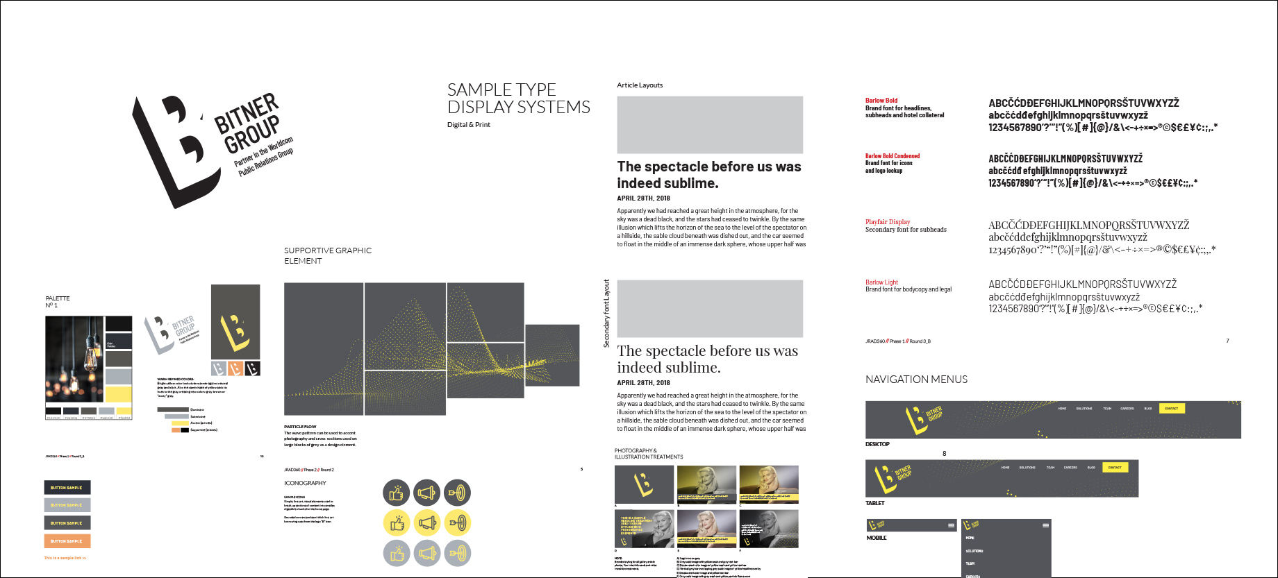
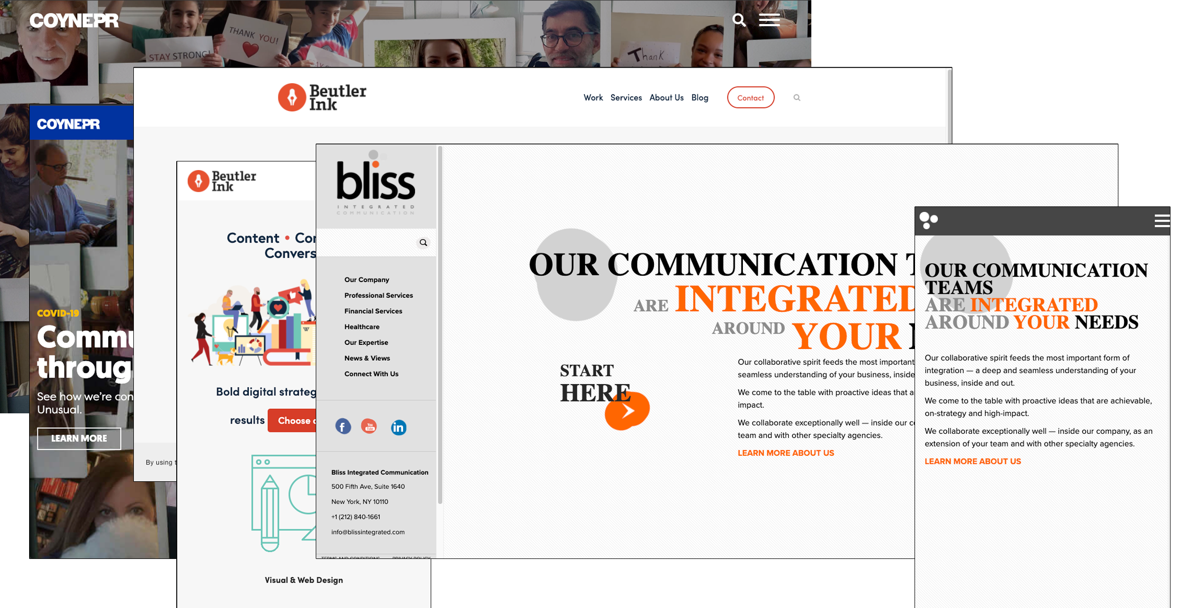
Receiving approval on refreshed brand guidelines made it was easier to develop a pattern library from existing assets.

  • I followed a corporate style with clean lines but used a bold, sophisticated color palette and modern typefaces.
  • I based the design off of the IBM design language but slimmed it down to essential modules and reusable elements.
  • The final design told me that my users were tired of the old site / branding therefore welcoming a contemporary and compelling visual interface.
  • The identity design helped achieve business goals by properly positioning itself as a credible and national competitor in the corporate PR industry that embraces technology.
Outcomes & Results
vist the staging site
Challenges

I find it easier to justify expert branding and responsive website design as users browse for content and research from credible sources. Highlighting the firm's functions through case studies along with a mobile first design, an inbound digital marketing strategy, lean site structure, SEO optimization and the proper social media integration can have positive outcomes with visitors performing organic searches.

  • The project finished development earlier this year with some minor tweaks to the asset library and branding guide.
  • I proud of the custom CMS I built for the client, however its only 90% self-contained, some custom tweaks must be delegated to a webmaster for additional support in the future.
  • Having more time to design and laying out the project in wireframes for pre-approval managed expectations beautifully allowing for a buttery, smooth launch.
next example

Need more proof?

Let's discuss your next project.

email me