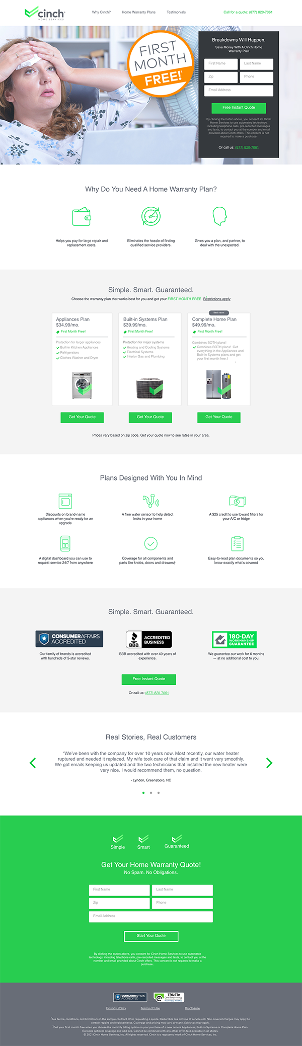
My initial heuristic analysis considers the existing digital product's user experience falling short of current user expectations and industry standards, leading to dissatisfaction, low engagement, and high bounce rates.
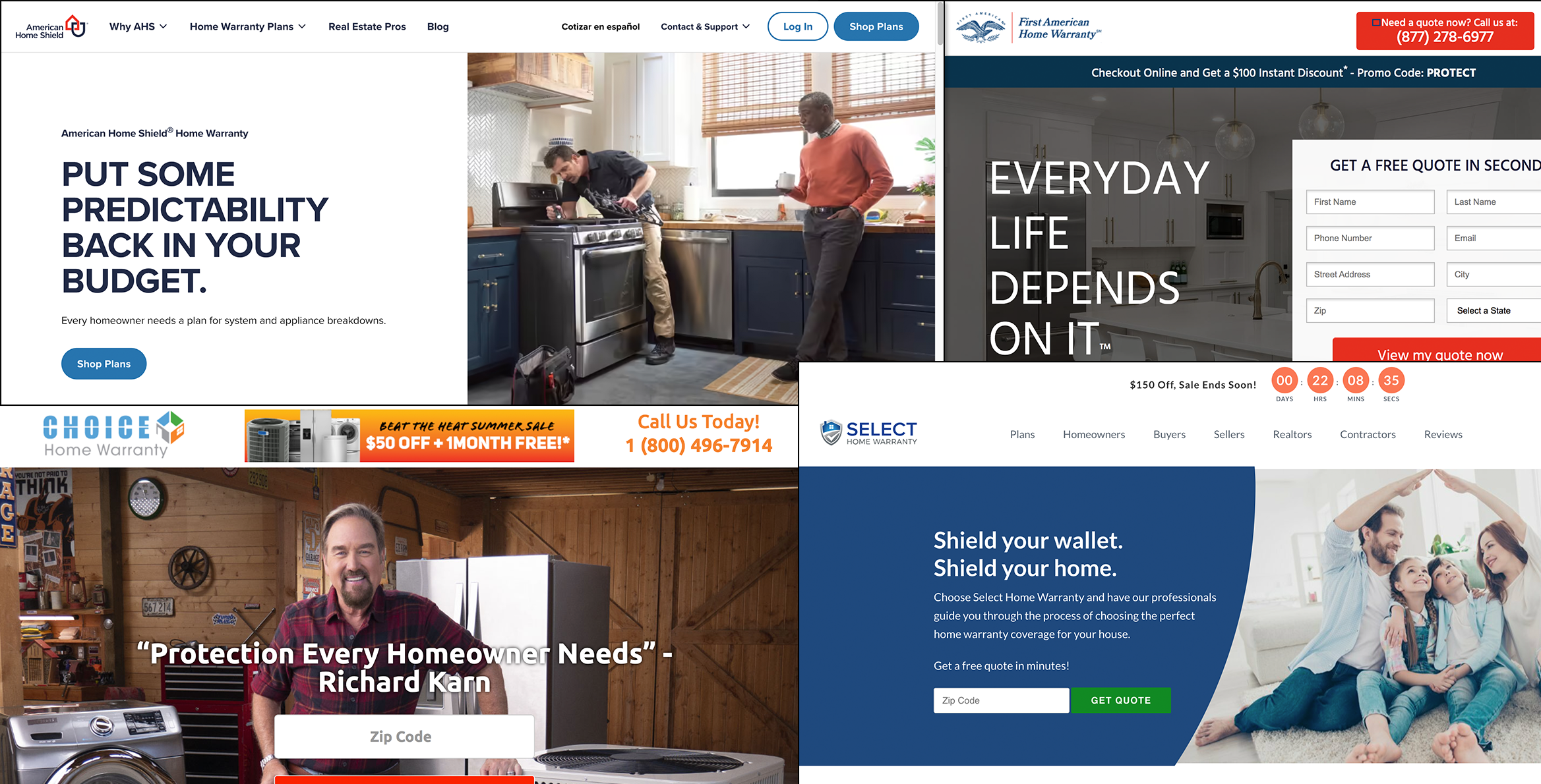
In the process of designing the new product features, I delved into qualitative data analysis due to its descriptive and open-ended nature, providing more profound insights. This research included a comprehensive investigation of direct competitors spanning local, national, and global markets. This competitive analysis played a pivotal role in shaping the overarching strategy, unlocking opportunities for enriched user experiences and content that the current website and product roadmap lacked.
This analysis also factored in key attributes such as the company's size, geographical location, and business focus, aiding in the identification of relevant comparative strengths. Interestingly, smaller firms that embraced digital transformations for their websites witnessed a substantial increase in their organic search presence, establishing heightened credibility.
Upon compiling a roster of direct competitors, I conducted a straightforward SWOT analysis to prioritize the most crucial features for concentration. To gain more profound insights into building user personas, I crafted a set of questions aimed at the identified user group. This set of questions underwent scrutiny from both marketing and the CEO, ensuring alignment with the client's needs and revealing deeper insights. The culmination of this research-driven approach allowed for a refined product development strategy with a heightened focus on user-centered features and enhanced competitive positioning.
While current competitors concentrate on gimmicks from the past only a handful paid close attention to UX.
To initiate the ideation process, I convened a collaborative workshop that included members from the product, engineering, and marketing teams. This diverse assembly of individuals brought various viewpoints and expertise to the table. The primary objective of the workshop was to enrich our comprehension of our users by crafting user stories centered around fictional personas. These personas were constructed using market segment data derived from our site visitors.
This method effectively bridged the divide between raw data and relatable human experiences, fostering a more profound understanding of our users among all team members. The resulting user stories served as a cornerstone for making design decisions that were in harmony with user requirements. This inclusive approach not only improved team alignment but also reinforced our commitment to delivering a product that prioritized the user experience.
In the workshop, I guided attendees to construct personas based on their user stories. This exercise facilitated the development of empathy throughout the buyer journey and unearthed valuable insights that had the potential to enhance our conversion rates.
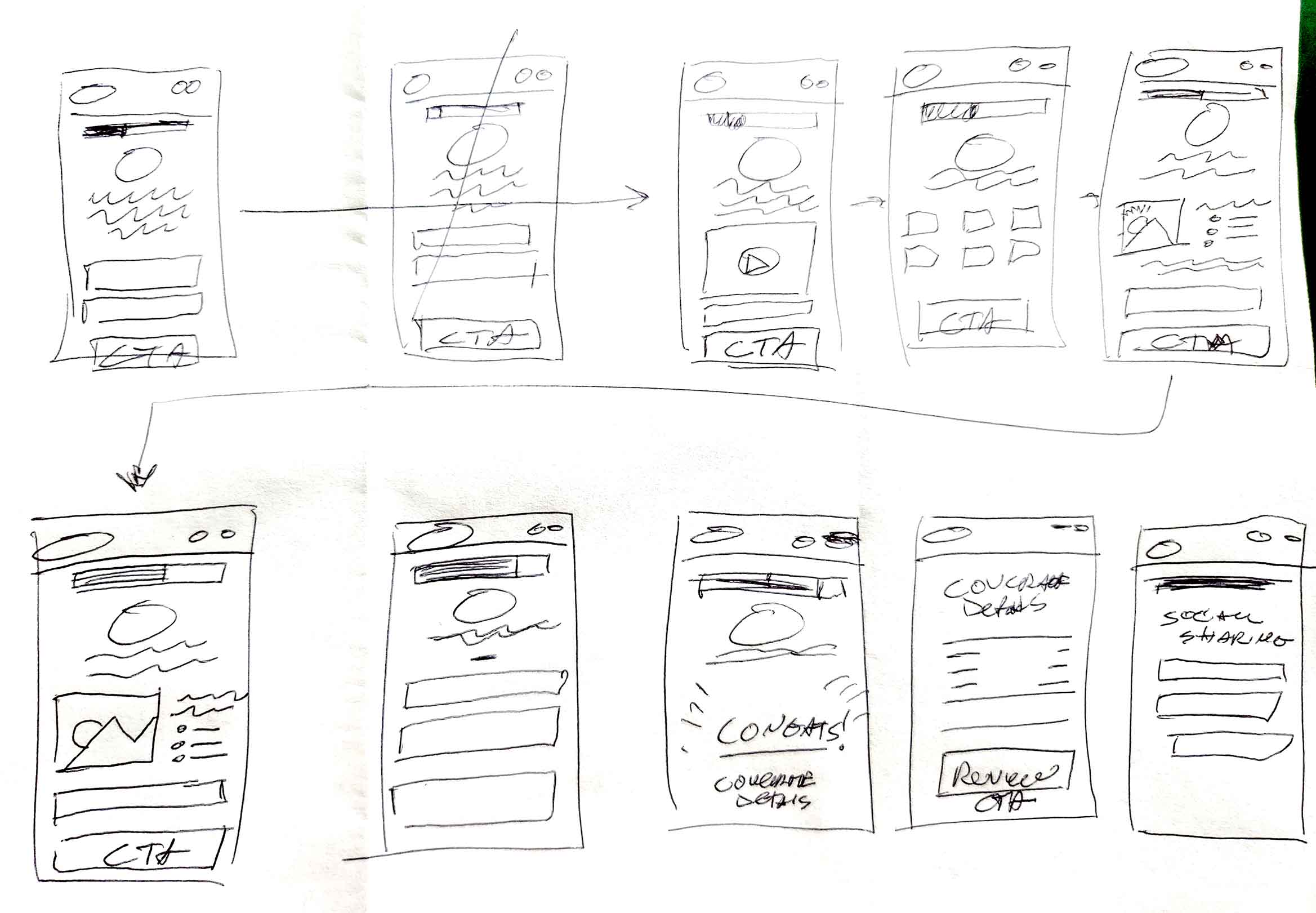
I designed a collection of medium-fidelity prototypes to assess their feasibility with our engineering team and to refine the concept for stakeholder review. These prototypes consisted of two mobile sets, catering to users with and without prior warranty experience. Through testing, our engineering team identified an issue in the process of editing quote addresses, resembling constraints found in our current enrollment system. This discovery prompted a design modification before progressing to the development of a high-fidelity prototype.
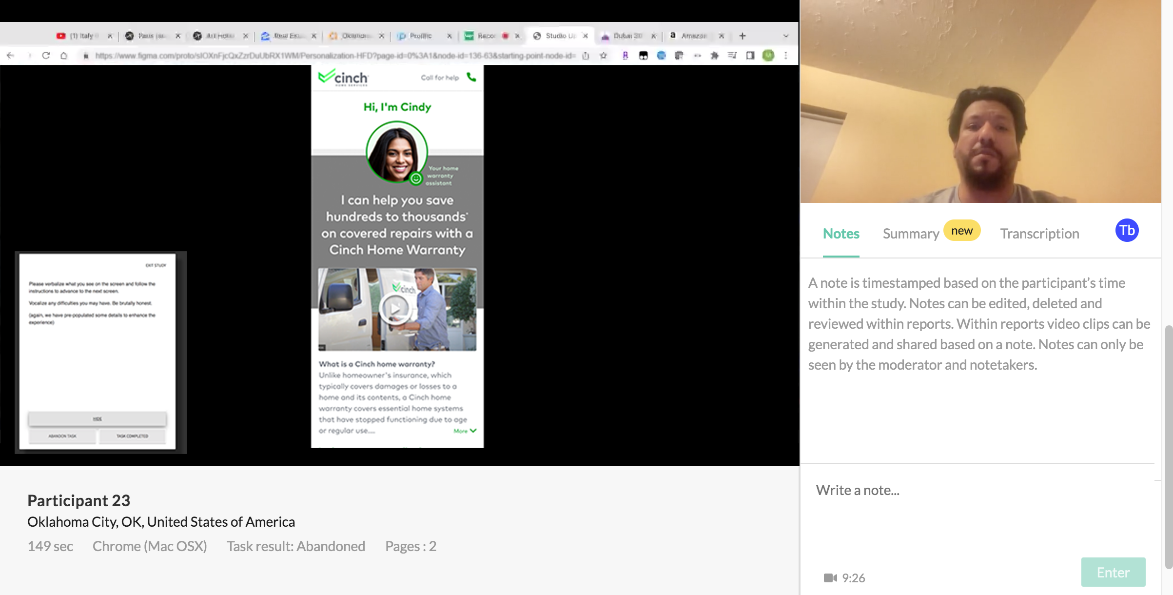
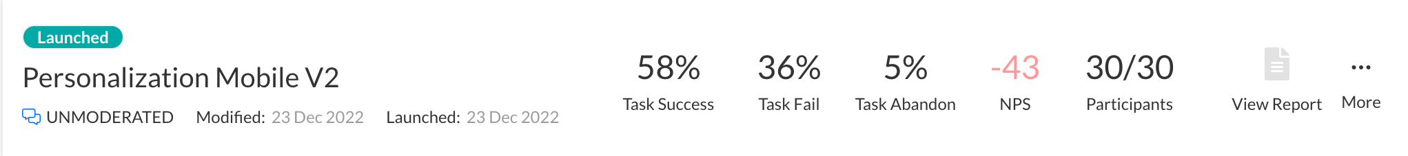
Testing was organized into three sessions, catering to both mobile and desktop users. In the initial round, interviews were recorded, guiding subsequent design modifications. The second round involved unmoderated tests, which notably yielded a higher success rate.
The initial round of user interviews provided crucial insights that led to significant design adjustments aimed at accommodating user preferences. These changes not only validated the design but also positioned it as superior to the current model. Users perceived the new design as a premium service, and, on average, they indicated their willingness to pay twice as much for each quote.
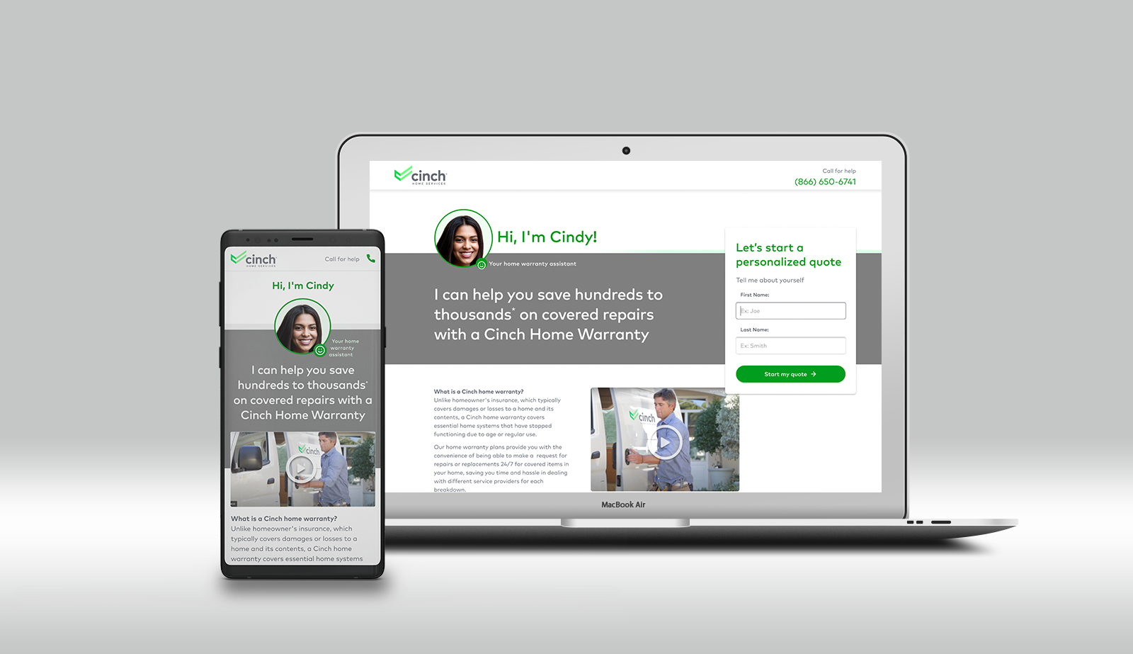
Receiving approval for refreshed brand guidelines paved the way to create a pattern library using existing assets. I adhered to corporate aesthetics with bold colors and modern typefaces, adjusting it to fit the current brand. The design aimed for improved accessibility standards. The resulting design reflected users' desire for a contemporary look and aligned with business goals, positioning the brand as a competitive player in the home warranty industry.
Taking control of modifying our existing branding materials proved essential for validating assumptions. I directed my attention to aspects that aligned with both engineering and marketing's brand guidelines, particularly those hindering scalability. In terms of accessibility, I improved readability by darkening the text and enhanced the user interface by enlarging and rounding buttons to bolster conversions. To further streamline our design efforts, I constructed a compact framework, which would eventually expand into a comprehensive pattern library for engineering to adopt upon approval. This included the creation of a card framework, which greatly improved the clarity of mobile experiences.
Moreover, to enrich the user journey, I introduced joyful animations and reduced cognitive load by featuring an avatar that functioned as an AI assistant. Testers overwhelmingly favored these additions, which ultimately enhanced the overall user experience.